
Sponsored by

 LUXE PROMPTING
LUXE ORIGINAL PROMPT WORKSHOP
Give every color one job
When every part of an image shouts in a different color, the subject can get lost. This workshop assigns three colors three different jobs: structure, light and emphasis. Our fictional orchard courier provides a concrete example you can inspect, copy and vary without turning the prompt into a long list of color names.
What would you delegate if you had a whole team?

With Skydive, you can build a team of AI agents to take work off your plate.
Create agents for customer support, sales, marketing, engineering, ops, and more. Give each one a role, connect the tools they need, and hand off the work.
Your agents can work on their own or together, sharing context and handing off tasks to get bigger jobs done.
Start with one agent. Build a whole team around you.
The Short Version
- Choose a structural dark, a light surface color and one small accent.
- Assign the accent to the subject you want noticed first.
- Inspect the result at a small size before adding new colors.
A palette is a set of roles
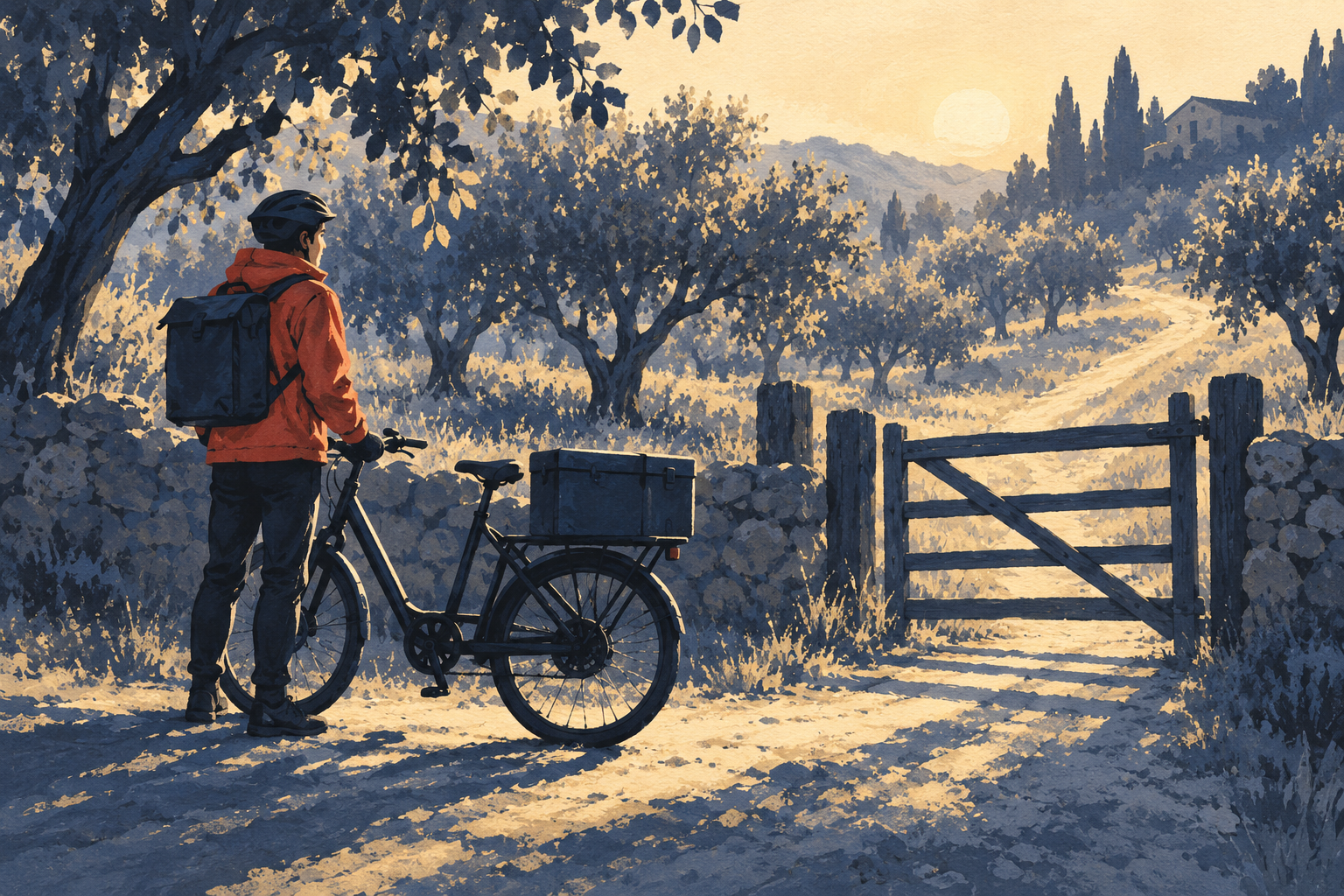
Original Luxe editorial illustration generated from the exact prompt below.
The illustration brief uses deep indigo for shadows, warm cream for light and muted vermilion for the courier’s jacket. Those are roles, not just swatches. The jacket has a reason to be the strongest color: it marks the person in a scene full of trees, a gate and a bicycle.
A restricted palette can still contain variation in value and texture. The goal here is a clear family of colors, not a claim that every pixel uses one of three exact numeric codes. If you need exact brand colors in final production artwork, verify and correct them in your design workflow instead of assuming a text prompt guarantees them.
The generated example keeps the red jacket distinct against cream and indigo surroundings. It also adds a dark backpack, and the painted vegetation is more detailed than the requested broad simple shapes. Those are visible differences to address if you want an even more reduced illustration.
Write the color plan before the scene
Choose the first thing to notice
Name one subject. In this scene it is the courier, so the accent belongs to the jacket. If the delivery box were the real story, the accent instruction would move to that box and the jacket would become quieter.
Keep supporting objects connected
Describe the bicycle, gate and trees as subordinate shapes within the dark-and-light palette. You want enough contrast to read them, but not a separate bright accent on every object.
Use one compositional path
The diagonal orchard path carries the eye deeper into the picture after the rider. Avoid piling arrows, spotlight effects or competing lines onto a scene that already has a clear direction.
The complete prompt
Create a landscape 3:2 editorial gouache illustration of a fictional bicycle courier stopping beside a small orchard gate at early morning. The rider stands to the left of a simple cargo bicycle; one closed rectangular delivery box sits securely on its rear rack. Build the whole scene from a restricted palette of deep indigo shadows, warm cream light and a single muted vermilion accent confined to the rider's jacket. Use broad opaque brush shapes, subtle paper texture and clear silhouettes. Compose the orchard path as a gentle diagonal toward the upper right, with simplified trees forming a quiet background. The red jacket must be the first visual focal point, followed by the bicycle and then the gate. No writing, logos, watermark, extra parcels or decorative neon colors.
Check the hierarchy, not just the hue
Shrink your result until it is roughly the size of a phone notification image. What can you still identify? A clear silhouette and a useful difference between light and dark can matter as much as the named accent color. If the jacket vanishes, inspect its shape and surrounding contrast before demanding a brighter red.
Now return to full size. Look for accidental accent-colored objects elsewhere: a red sign, a second bright parcel or a vivid flower patch can pull attention away from the subject. Describe any unwanted competitor precisely in the revision rather than adding an ever-longer generic negative list.
- First glance: the jacket should attract attention before the orchard details.
- Shape: the rider and bicycle should remain separately readable.
- Placement: the accent should not appear equally strongly in unrelated corners.
- Texture: brushwork should support the illustration rather than hide its forms.
Try an honest color experiment
Keep the scene and composition wording fixed, then move the accent from the jacket to the delivery box. Ask for the jacket to return to the indigo-and-cream family. The question is specific: does the box become the first thing you notice?
Only the original generated example is included here; that second image is a suggested exercise. Compare your own results before deciding the palette worked. If the model changes the camera angle, subject size and lighting too, the pair cannot isolate color alone. Record those differences and use the comparison as exploration rather than a controlled performance claim.
Source Desk
Original Luxe Prompting editorial prompts and AI-generated illustrations prepared September 30, 2026. These are creative exercises, not member submissions, a popularity ranking or a model comparison. The full prompt beside each image is the exact brief used to generate it. Results may vary across tools and subsequent runs.
A clearer brief. A more useful result.